LET'S MEET!
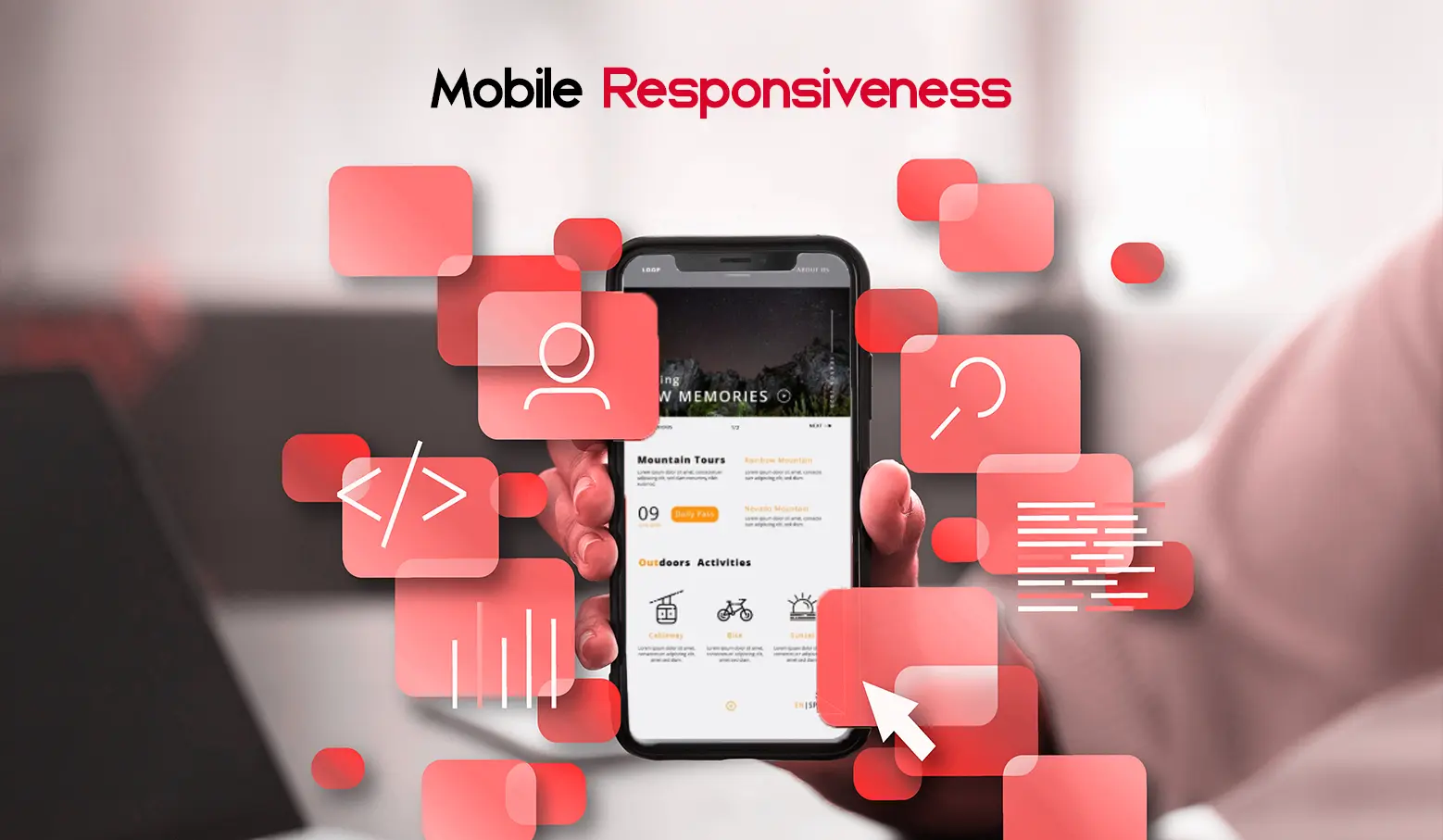
You’re Losing Customers Daily If Your Website Isn’t Mobile-Friendly
Here’s a fact you can’t ignore: more than 60% of global web traffic now comes from mobile devices. That means the majority of your visitors are landing on your site using their phones and if your website isn’t optimized for that experience, they’re leaving fast.
At Quatrotek, a leading pioneer in web development and web design, we craft responsive, user-first websites that don’t just look good, they work flawlessly on any device. In this blog, we’ll show you why mobile responsiveness is no longer a “nice to have,” but a must-have for conversions, SEO and staying competitive.
1. What Does “Mobile-Friendly” Really Mean?
A mobile-friendly website automatically adjusts to different screen sizes, delivering a seamless experience across phones, tablets and desktops. No pinching, zooming or slow load times.
- Text is easy to read
- Buttons are easy to tap
- Layouts shift smartly based on device size
Why it matters:
Since Google switched to mobile-first indexing, it ranks your website based on its mobile version. A clunky mobile experience means lower visibility in search results.
2. How a Non-Responsive Site Is Hurting Your Business
If your site isn’t mobile-optimized, you’re missing out. Here’s how:
- High bounce rates: Users leave if they can’t navigate easily
- Poor user experience: Frustrated visitors don’t convert
- Lower Google rankings: Mobile usability is a ranking factor
- Lost sales and leads: A complicated checkout process kills conversions
- Weak brand credibility: A dated site makes your business look unprofessional
Every second counts. If users can’t find what they need in a couple of taps, they’re gone, probably to a competitor with a better mobile experience.
3. Not Sure If Your Site Is Mobile-Friendly? Start Here
If you’re unsure about your site’s mobile performance, start by reviewing the user experience on different devices.
Ask yourself:
- Is the content easy to consume without zooming?
- Are your call-to-action buttons easy to tap?
- Do images and layouts load correctly on smaller screens?
If you answered “no” to any of the above, it’s time to take action.
4. How We Build Mobile-First Websites at Quatrotek
At Quatrotek, we don’t just shrink your desktop site, we design for mobile first, ensuring performance and usability from the ground up. Here’s how we do it:
- Flexible layouts that adapt across all screen sizes
- Fast-loading pages with compressed media
- Thumb-friendly interface with smart button placement
- Clean, focused design that reduces friction
- Smooth navigation structured for mobile browsing behavior
Whether it’s a sleek landing page or a complex web platform, we ensure your mobile users get the experience they expect.
Ready to Go Mobile-First? Let’s Talk
Your website should work for your business, not against it. Take action now!
Your Next Digital Success Starts Here
We’ve helped brands launch high-impact digital projects that go beyond expectations, building trust, delivering results, and pushing the boundaries of what’s possible online.